
by Francois Muscat | Dec 12, 2013 | Mobile Marketing, Mobile Solutions
Using analytics for your website is an effective way to make sure you’re marketing your site the right way to reach your target audience. You can quickly and easily see how certain people are landing on your site, what they’re searching for and what attracts them (or detracts them) from your site. This is essential for marketing for mobile, as it helps you market your business by building a site that takes advantage of your audience’s search and web navigation habits. Google Real-Time Insights Finder is a tool that adds a whole new dimension to your analytics process.
What is Real-Time Insights Finder?
Google’s Real-Time Insights Finder is a tool for web analytics that allows you to see how your audience is interacting with your site in real time – that means as it is happening. You can therefore gain deeper insights into consumers’ web habits and not have to worry that your data is aged. This means being able to design a mobile marketing strategy that incorporates real, up to the minute insights for your target audience.
How to use the Real-Time Insights Finder
Firstly, you need to consider what your business is offering. It could be anything from plumbing to auto repairs. So use this as your starting point. Find out how and when people are searching for plumbing services. When does the search peak? What related keywords come out on top? Plumbing supply is the most popular related search term, so this info can then be used to further your marketing strategy. People seem to be looking for DIY solutions rather than paying for services. And so on and so forth. You can build a really effective marketing strategy using these analytics.
WSI is a company that can take your web analytics and translate it into digital marketing strategies that will help you gain customers. Contact us today to find out more.
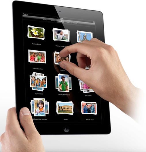
by Marelise da Silva | Jun 27, 2012 | Mobile Solutions, Website Design
With the introduction of the Apple iPad and the many variations of tablets found on the market it is becoming increasingly important for companies to tailor their websites to tablet users. The market share of tablets and iPads continue to grow, making it vital for web designers to understand the design implications of designing for screens that are smaller than desktops and larger than mobile phone screens.
Here are a few ‘do’s and don’ts’ of designing tablet friendly websites:
- Most tablets use mobile, not desktop browsers. Do not embody Flash if you want your website to be viewable on an iPad, for example.
- Do not have too many clickable areas close to one another. Good web design needs to ensure that navigation is easy to find and use for people who are scrolling with their fingers.
- Do not let too much media clutter the website. This can once again make navigation difficult for the user and could cause loading issues.
- After you’ve completed the initial design, access the website from a tablet and take note of any hang-ups. This should help you make the website tablet accessible while still permitting easy access from PCs and laptops.
- Add more “on the go” content to the website. Tablets users are mobile which means they might require some more ‘mobile-related’ content, such as Google Maps add-ins and other related applications.
- Be mindful that the font requirements are different for tablet users. People using tablets will be moving around town, and may suffer from screen glinting when outdoors as well as screens which are smaller than most PC or laptop screens. So make sure the fonts are large and that you’re using easy to read colours and graphics.
You don’t want to fall behind the times – a tablet friendly website will give your client more exposure.
Need help with your web design? Contact WSI OMS today.
by Francois Muscat | Mar 30, 2012 | Mobile Solutions
Globally, internet users are shifting their browsing preference from desktop to mobile. As phones get smarter, information is more readily available and results need to be instantaneous. 2011 stats from International Telecommunication Union show that in Africa, while there are only 1 million fixed broadband subscriptions, there are 31 million active mobile broadband subscriptions (via mobiThinking). Some stats show that more Africans have access to a mobile phone than to clean drinking water. And Opera’s ‘State of the Mobile Web’ report for January 2012 shows that both mobile page views and data consumption globally have increased by over 100% since January 2011.
Desktop browsing losing priority
According to Stat Counter, since 2010, South African mobile internet traffic has more than doubled from 8.09% to 19.33%, whilst desktop has lost 10 points, coming down from 91.91% to 80.67% over the same period. And, IT News Africa, reporting on the Mobility 2011 research project by World Wide Worx, notes that up to 39% of South Africans are now browsing the web on their mobile phones. Google Africa puts the number at over 12 million. Current predictions are that by 2013, more search queries in South Africa will originate from mobile devices, than from desktop computers.
How many websites are mobile ready?
But what is the state of the South African mobile internet? Statistics are hard to come by, but one American study (Mongoose Metrics Data Series) notes that only 9% of the web is mobile ready. A DotMobi study sites the growth of the number of new mobi sites has increased drastically from about 149 000 in 2008 to more than 3 million in 2010.
As more and more people take to browsing the web on their phones, the demands for access to websites that load quickly; render themselves easily read on smaller screens; and are lighter on both memory and bandwidth will increase dramatically. It will become a necessity that websites have both full and mobile versions, and helpful if they redirect the user to the appropriate site based on the device being used.
While it appears that we are on our way, the South African internet has a long way to go. If you want to make sure that your website visits can find you, you need to make sure your mobi site is up and running.
Need a mobi site for your company? Contact WSI OMS today!
by Francois Muscat | May 24, 2011 | Mobile Solutions
Do you know how your website looks and responds on an iPad or any other mobile device? Did you know that there’s a couple of emulators available that you can test your mobile website on? These online mobile emulators will give you a good idea on how your mobile website will look in a mobile browser environment. These emulators also gives you the opportunity to test your mobile website quickly.
Take note that these emulators are only for testing purposes and they should not replace testing your mobile website on actual mobile devices. Only use these emulators to give you a look and feel of how your mobile website will look on various mobile devices. Because they are online, they are very quick and easy to use. Each emulator will give you a different view of your website.
Opera mini
Opera mini is one of the most popular mobile browsers on mobile devices. It uses the Java ME platform and it requires that the mobile device must be able to run Java ME. You can test your mobile website at the Opera Mini simulator website.
dotMobi emulator
The dotMobi emulator allows you to test your mobile website how it will display on a normal mobile phone. You can select a couple of theme skins (Nokia N70 and Sony K750) when you run the emulation. Using this emulator, you will be able to see how millions of users will be able to view your mobile website.
iPhone simulator
TestiPhone.com is an iPhone based browser emulator that will show you how your mobile website will look on an iPhone.
iPad emulator
If you would like to test how your mobile website will look on an iPad, use the iPad Peek web based emulator. To see an accurate simulation, use the Apple Safari or Google Chrome.
by Francois Muscat | Sep 21, 2010 | Mobile Solutions
The most popular Web 2.0 websites are linked to a mobile friendly version. This is due to the fact that the mobile web is growing at quite a fast rate and more people are focusing on searching the internet via their mobile phone if they need information fast. It is a on-the-move business tool that is always available.
Mobile friendly pitfalls
The only problem with a mobile version of your website is that you have to get one. It usually involves the development/designing of a new scaled down version of your current website. When creating a mobile website there can be many pitfalls – technology wise.
If you have a WordPress blog, you are saved!!! There’s a couple of “mobile ready” WordPress plugins available that you can install without any tweaking on your side. Find below a list of the mobile ready plugins that I have found.
Mobile WordPress blog addons and themes
WordPress Mobile Edition is a fantastic plugin from Alex King’s Crowd Favorite that builds a mobile version of your blog and even adds a commenting interface. Their mobile demo on the Carrington theme is quite attractive indeed. Smaller screens do not display this as well as the iPhone does.
WordPressMobile.mobi (I just noticed the WordPress in the domain name) A WordPress mobile plugin by Andy Moore that provides a mobile version of your WordPress blog. The site does not provide any screenshots or details, just a forum. Looks like a very popular plugin with lots of installs.
WordPress Mobile Pack by James Pearce is a well liked set of plugins that creates a mobile environment for your WordPress blog including the admin panel. Screenshots are included on the extend pages.
Mobilize is another plugin that renders your WordPress blog via Mippin and even allows the user to insert their own ads. The plugin touts to be configuration free. Clean and tidy.
WordPress PDA and iPhone is a simple, straightforward plugin that renders a simple version of your blog on a PDA. Output screenshots on the plugin page.
MobilePress is a WordPress plugin that will render your WordPress blog on mobile handsets, with the ability to use customized themes. The plugin also allows specific themes for specific devices / mobile browsers, such as iPhone, Opera Mini, Windows CE Mobile and other generic handset browsers. Nice site, good screenshots, simple install.
WPTouch is a mobile plugin and theme combination for WordPress that adds a sleek WordPress theme for iPhone visitors.
There are various other plugins available on WordPress that extends the mobile functionality of your WordPress blog. Choose one that fits your needs and just let it run.
By making your blog mobile ready, you are opening up new ways for interesting people to read your message.
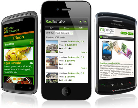
by Marelise da Silva | Sep 8, 2010 | Mobile Solutions
The mobile web (mobile website) is an open field in web development and web design. Businesses are quickly converting their normal websites to be mobile compatible to take the advantage of this growing technology trend.
There is a couple of aspects to take into consideration if you are planning to create a mobile friendly website for your business.
Text or graphics
The smallest mobile handset screens have resolutions of 128 x 160 and these work best with text only. More and more mobile handsets are being released with larger screen sizes. Having more graphics works well on medium and larger screen sizes, but the graphics also need to be optimized for them. Graphics must be small in size and they must be able to load quickly.
Different resolutions
What size screen should designers design for? This really depends on what mobile phone your target market is using.
- Feature phones have smaller screens with a size of 176 x 220 pixels. Today these are the most popular mobile devices for accessing the Internet.
- Smart phones have a larger screen size of 480x 320. Smart phones are the fastest growing segment of the cell phone market.
If you are targeting a mixed market (smart phone users and feature phone users) a maximum size of 200 x 250 pixels is strongly recommended.
Location
It is a myth that mobile websites should be on a top-level domain (.mobi). It is practical to have a mobile website only on a sub domain of your website eg “http://m.mashable.com”. Web sites can automatically detect what platform a visitor is accessing the site through and redirect them appropriately. That means that if a user browses to your normal website via their mobile browser, they are redirected to your mobile friendly website.
Keep it simple
A mobile phone is a “on the move” business tool as users can quickly look up information on the mobile web. Keep the menu structure of your mobile website simpler and easy to navigate. Allow users to reach the content they are looking for in a few steps if possible.
The future and beyond
More and more people and businesses are realising the power of the mobile web. People are busy trading in their cell phones for smart phones at an increasing rate. By the end of 2009, most major companies will have mobile compatible websites. Within the next 3 years, most businesses will have mobile versions of their website to take advantage of this trend.