
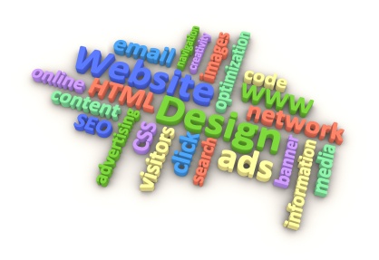
by Marelise da Silva | Oct 20, 2014 | Website Design, Website Optimization
Images have the potential to generate a lot of traffic through image based search engines, but an image alone is not enough. There are a number of tools you can implement in order to optimise your images and gain maximum exposure by making them SEO friendly.
Tools for image optimisation
Alt text is an excellent way to help search engine spiders find your image when the key words are entered into the search engine. You do this by adding the necessary key words to your image tag, for example: alt=”peanut butter.” This will help make your image recognisable to Google and bring in more search engine results.
A simple thing such as your file name should also not be overlooked. When you add an image, be sure to title it in such a way that it will receive the necessary rank when the key words are entered into a search engine. Choose something descriptive and obvious for best results and test it out yourself once the image has been added.
The important thing to remember when it comes to effective website design is search engine optimisation. It stands to reason that image size is very important for fast downloading, so make your image as small as possible without compromising the quality.
At WSI OMS, our goal is to help you and your business get the maximum online marketing benefits. From web design, to social media, mobile marketing and more, our experts will guide you every step of the way and help boost your business into the stratosphere. For more information, feel free to contact us.

by Marelise da Silva | Oct 15, 2014 | Website Design, Website Optimization
There is a host of benefits that come with having a business blog as part of your digital marketing strategy. Using tools such as WordPress have made blogging far more effective and user friendly and this was only improved with the development of plugins.
Plugins essentially came about to add extra features to WordPress without altering the original code and were created in order to enhance the functionality of your site in one way or another. The idea of creating plugins generated a lot of excitement which spread and now WordPress has the ability to do more than the creators ever dreamed just by making use of these nifty little tools.
New WordPress Plugins will boost your social media marketing
Here are some examples of a few of the latest and most useful Plugins you can get to improve your site. The best part? They’re free and ideal for non-coders.
- Simple Author Box. This is an easy way to include your own customisations to your page and improve the overall visual impact. You can make use of web fonts from Google and even include icon-links for social media
- This provides its own templating language which allows you to more easily develop your WordPress themes.
- Memoria Ticket System. This Plugin allows you to create a customisable form for help tickets and will allow you to sort them by category and department.
These are just a few of the plugins which will help make your site more user friendly for both you and your customers. When it comes to online interaction, people want functionality efficiency and making use of tools such as these will go a long way in helping you create the digital marketing image you need.
At WSI OMS, our expert team specialises in all aspects of digital marketing and will help create a tailor made package to market your brand online that includes effective web design, mobile marketing, Search Engine Optimisation and more. Get in touch with us today.

by Marelise da Silva | Sep 3, 2014 | Website Design, Website Development
There are many different ways to implement a social media marketing strategy. While many businesses focus on growing their online communities organically through shared content, likes and retweets, many companies are realising the benefits of paid advertising.
In the SEO world, paid advertising generally refers to Pay-Per-Click campaigns. In social media, Facebook advertising is where the real impact lies. What makes Facebook advertising such a worthwhile venture is the fact that you target your ideal customer with ease.
With PPC, for example, you’ll be able to appear on the first page of Google when someone types a relevant search term into the search engine, but Facebook has taken this segmentation to a whole new level. You can choose to target anything from location, interests and gender to life events, likes (such as brand connections) and the apps the person uses.
No other paid search strategy has this many options, which is why Facebook is particularly useful for marketers and business owners. Besides being able to target specific users, marketers can also create “custom audiences” for the advertising campaigns. These audiences comprise clients that your company already has a relationship with. The real benefit of this is that you can use e-mail addresses, phone numbers, Facebook contacts or even transfer your Google+ contacts to Facebook to set up these audiences.
After you’ve set up your target audience and custom audience, you can even create a “Lookalike” audience that lets you target new audiences who have similar characteristics to the audiences you’ve already created.
These features are all unique to Facebook, making it one of the most relevant platforms to advertise on. If you need help with your social media marketing strategy, contact us today.
by Marelise da Silva | Aug 27, 2014 | Blogging, Website Design
When it comes to website development, we’ve been around the blocks a few times. While every designer knows how important it is to get a proper brief from a client, there are quite a few things that need to be established before the developers of the website can start coding.
In order to make sure the website meets the needs of the clients and that everyone’s on the same page about what needs to happen, follow this step-by-step process when meeting with your client and the rest of the web development team:
- Set out the objectives of the website
- Get everyone to agree on the scope of the work in writing. This scope should include timelines, who owns (and will be hosting) the website as well as the budget. Make sure the budget can be changed if the client decides to include extra features during the development phase.
- The website designers should ideally create a mock-up of what the home page should look like. Simple things like logo placement, corporate colours and calls to action need to be agreed upon before the website is developed.
- Create a site-map. This wireframe will include all the main navigation buttons, tabs and features that the website needs to offer.
If you want to remove unnecessary re-dos and back-and-forth meetings about simple things like the font or the basic look and feel of the website, it’s important to have inclusive brainstorming sessions with the client right from the get-go.
Need an experienced web development company to take care of your website and web apps? Contact us today.
by Marelise da Silva | Jul 30, 2014 | Website Design, Website Optimization
When it comes to responsive web design, the focus is on creating a great, snappy user experience. The goal is to make it easy for your website visitors to do business with you / research your business online and your website needs to be intuitive to achieve this. Responsive web design, however, isn’t without its challenges. Here are two common challenges that we’ve come across and solutions on how you can address this:
Hiding content
One of the key aspects of responsive web design is being able to a better user experience across the board. This often means that you’re not steam-rolling a mobile website visitor with too much content (because they can’t be expected to scroll for kilometres on end).
Responsive sites share a single code base, which has many benefits, but one of the pitfalls is that some of your content may be hidden in order to accommodate different screen sizes. You don’t want to deny mobile users any functionality, or content on your site, so the key is testing your design usability on different platforms before you launch the new site.
Quick loading times
Ensuring quick web page loading times is a must-have, but this can be especially challenging if you’re not careful with your responsive web design. You only have 10 seconds to keep the attention of a person visiting your site from a desktop computer. A recent study showed that 74% of mobile users will leave the page if it doesn’t load within five seconds – so you don’t have a lot of room to play with. Rather cut down on content and graphics (but do this wisely) than make a mobile user wait for a page to load.
Want to make your web design more responsive? Contact WSI OMS today.

by Marelise da Silva | Jul 23, 2014 | Website Design, Website Optimization
Remember back in the day when websites had the cheek to tell you their site was the “best viewed in Internet Explorer”? With all the planning, money and effort, you would be a fool to turn away any website visitor because their browser or platform doesn’t really work well with your site layout (and trust us – nobody is changing their browser or down-grading their phone to be able to search your site).
Today, you need to make sure your web design is completely user-friendly across all the popular new tech gadgets as well as a range of internet browsers. Ten years ago, most internet users had display resolutions of 800×600. Nowadays, most people have resolutions far greater than 1024 pixels in width.
Most of us designers like to work on wide screen computers, but this doesn’t mean that we can create websites like this. Nobody likes to scroll horizontally on their tiny phone screen, so keep these width guidelines in mind in order to avoid designing very wide screen websites that don’t display correctly on mobile devices.
Colours are another problem for web designers. Colour codes like #F2C3BE don’t look the same on all screens (and this can be a particular problem for companies with established corporate design and colour guidelines). This colouring system is pretty outdated and we’d advise website designers to only use colour combinations that are multiples of the hexadecimal “33”.
These are only some of the ways that your web design can be affected by different browsers and platforms. For more information, contact WSI OMS today.